Visualize
 Correlate Disparate Sources of Data and Visualize It
Situation Rooms combine many different types of data, including documents, videos, and streaming data. Often, the first step is visualizing and charting structured data.
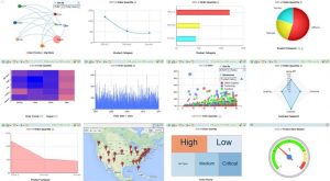
Look at the videos of the many reporting options that we support for analyses. Each of these methods can be automatically linked together so that selecting one or more records in one graph changes the selections in another.
From a data grid, there are numerous options that can be selected for presentation. All of these maps can refresh periodically.
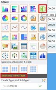
- Graphs: Bar, pie, line, scatter, radar, area, gauge, time plots
- Pivot tables
- Geographic: Google earth, maps, images, overlays
- Alerts (including SMS or email), KPI’s
- Heat maps, tree maps
- Unstructured data: images, videos
- One-click multiple charts (4,6,8,12 charts)
Workflow processes can be built to operate behind the scenes to populate information